Style of Living
Client
Sector
Auction House
Date
June 16, 2021
Category
Auction Catalogs
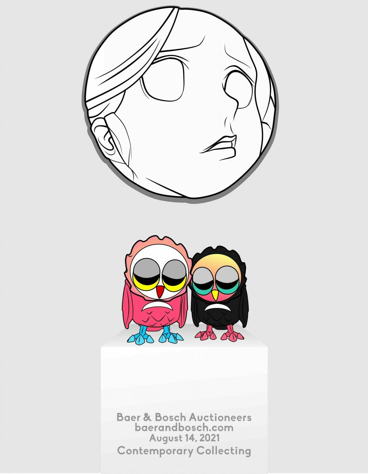
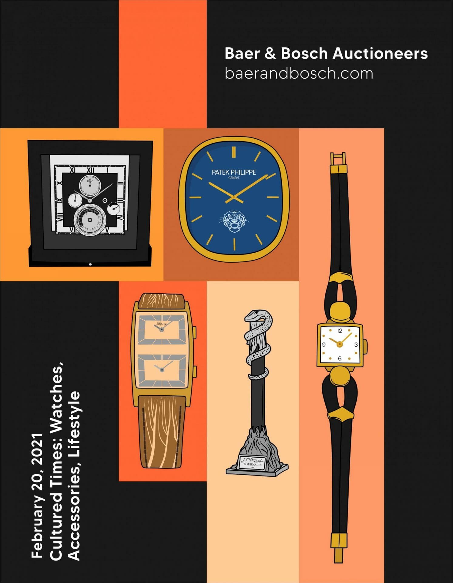
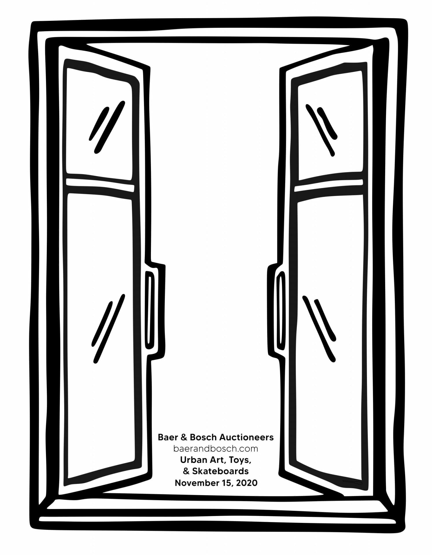
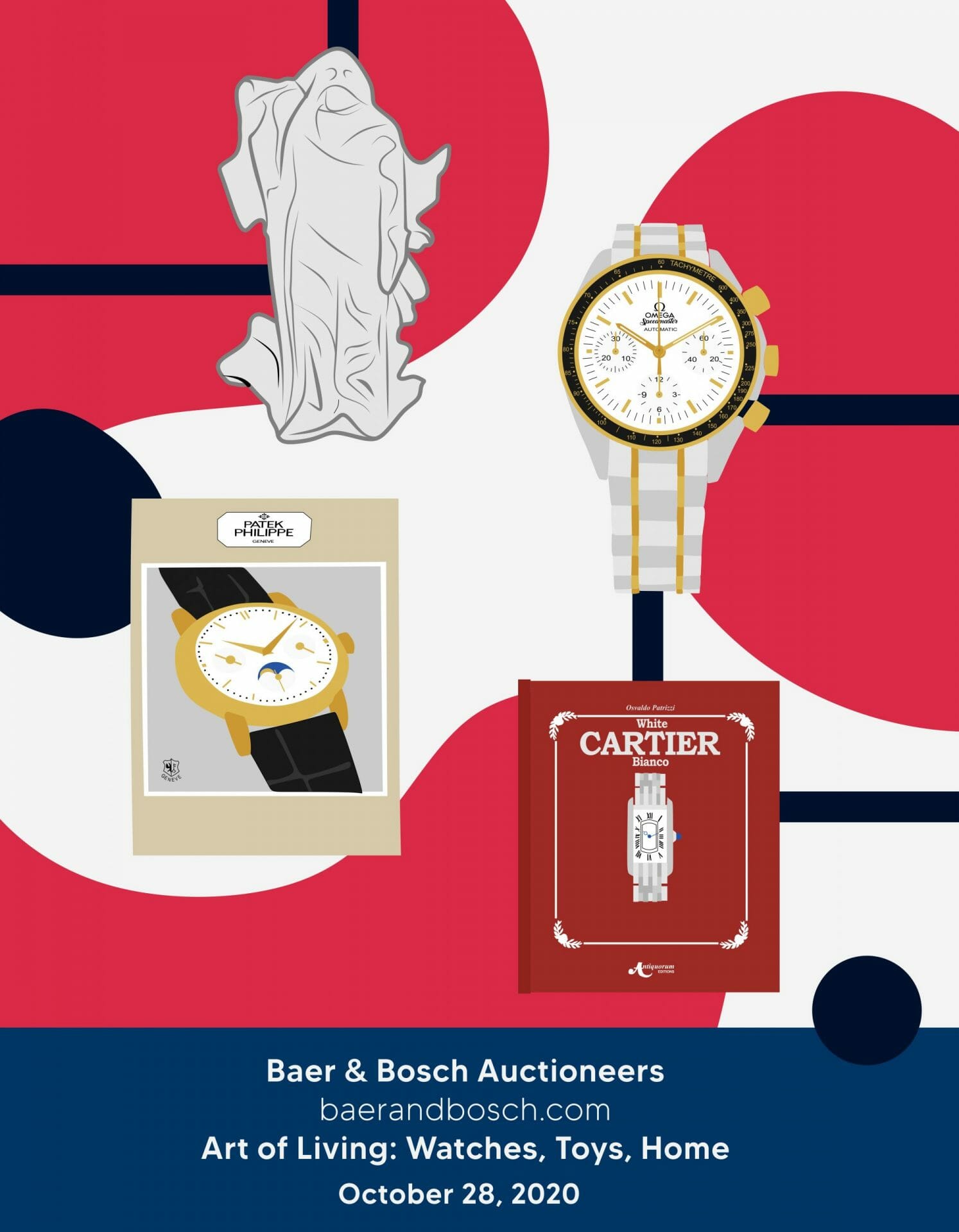
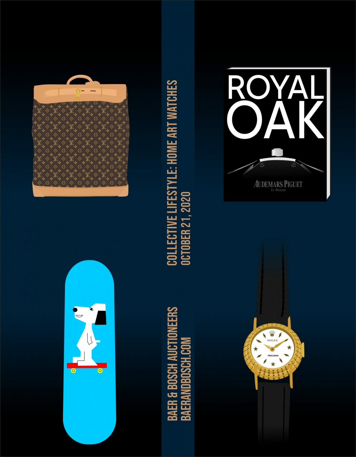
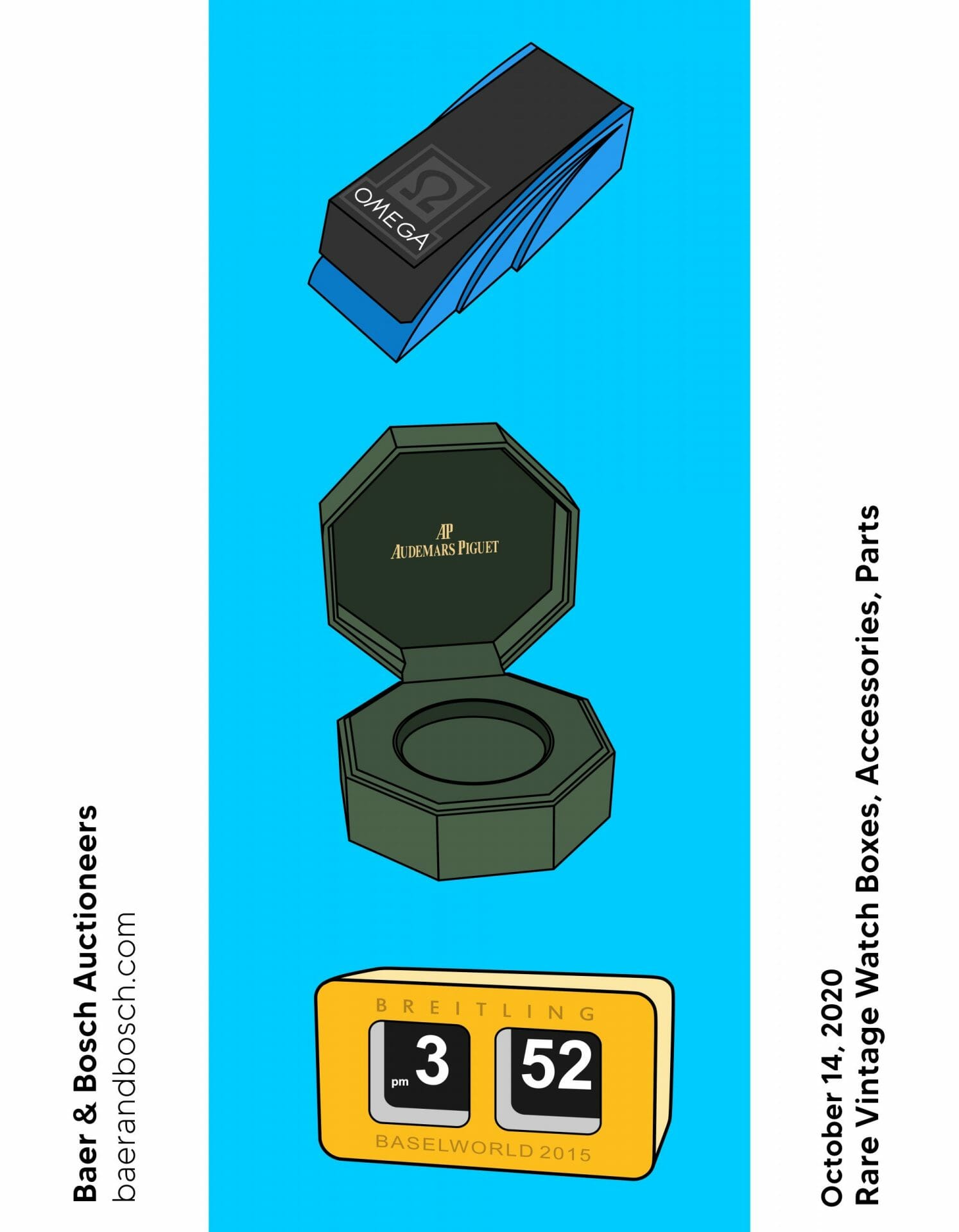
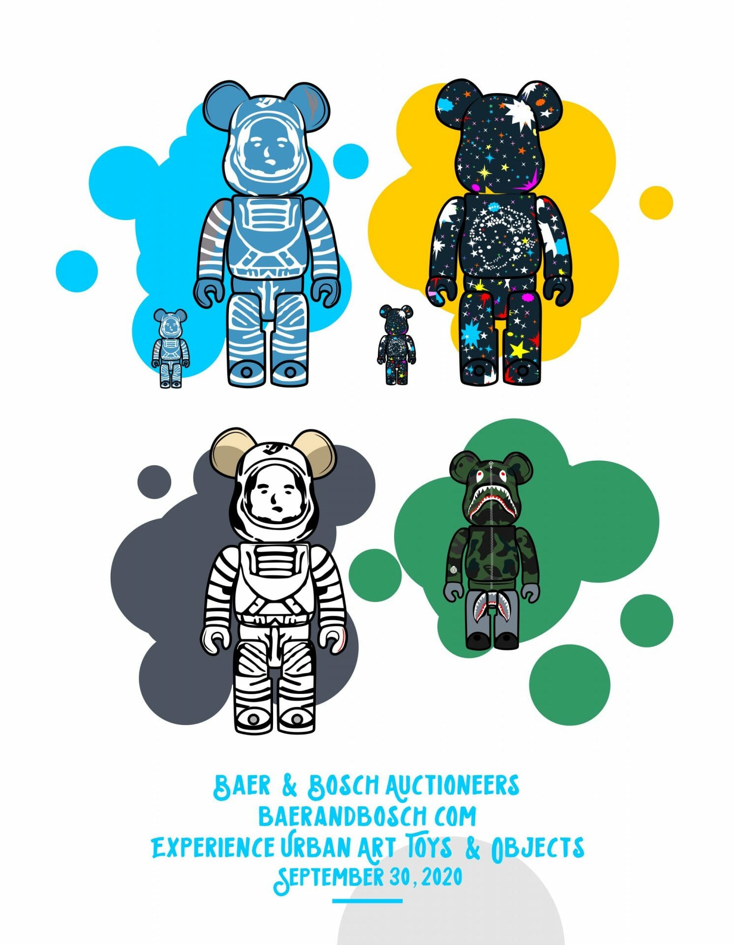
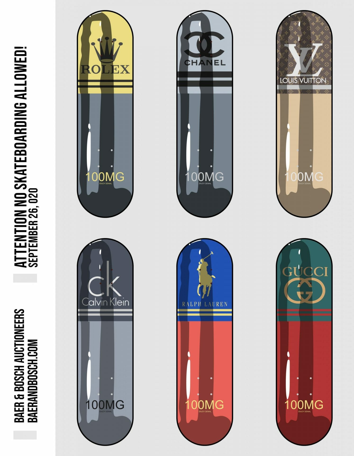
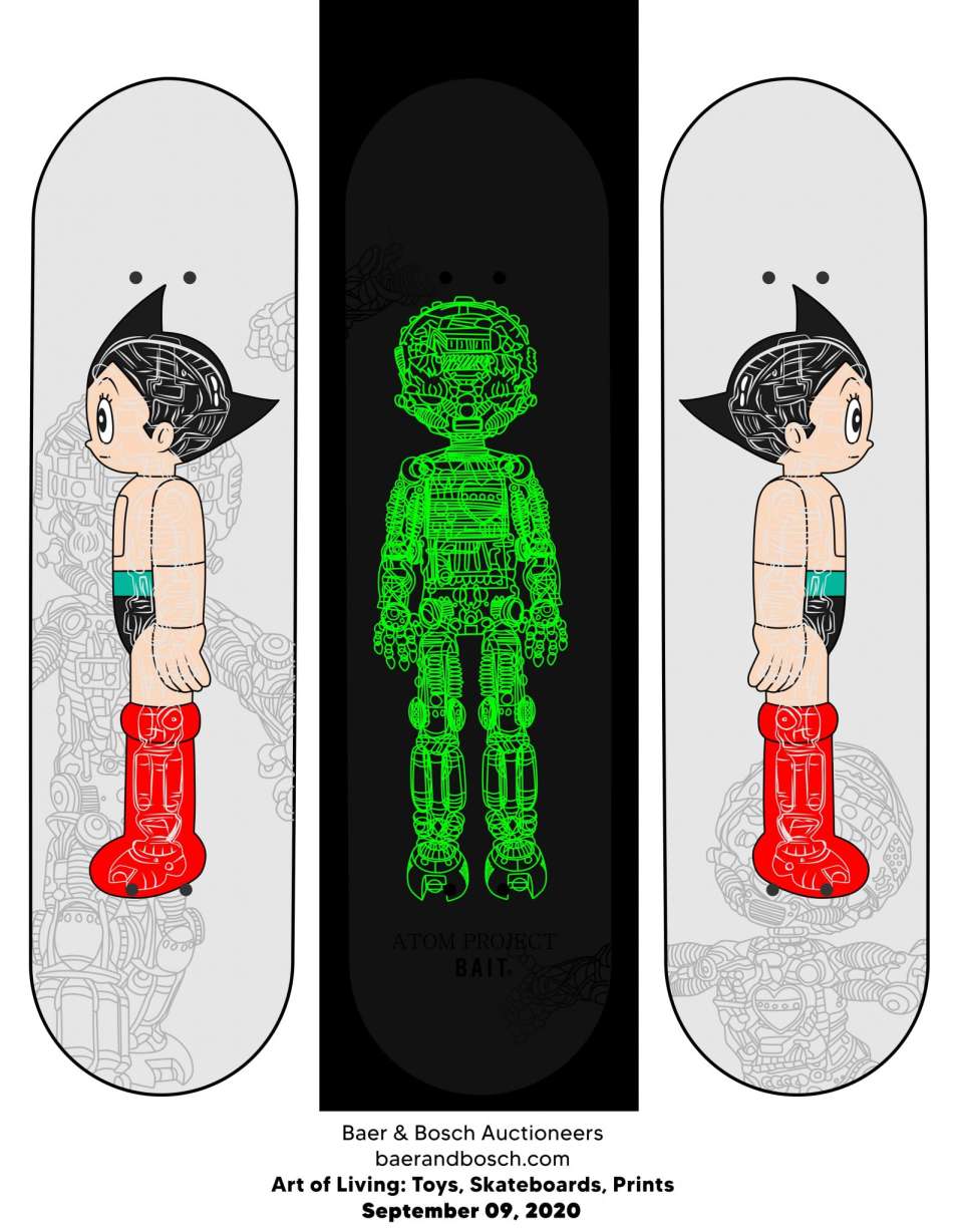
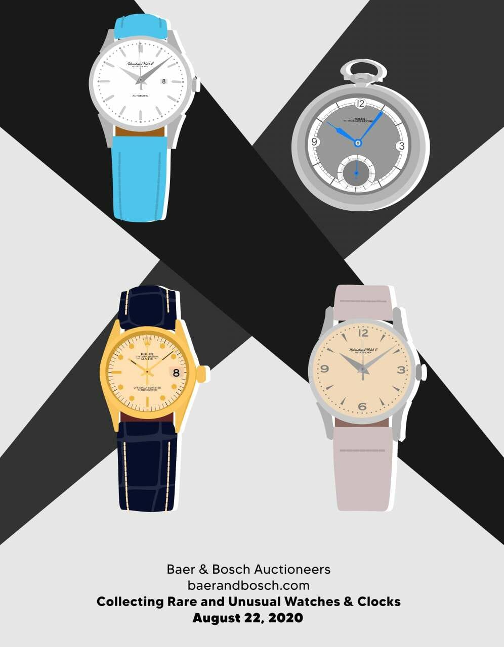
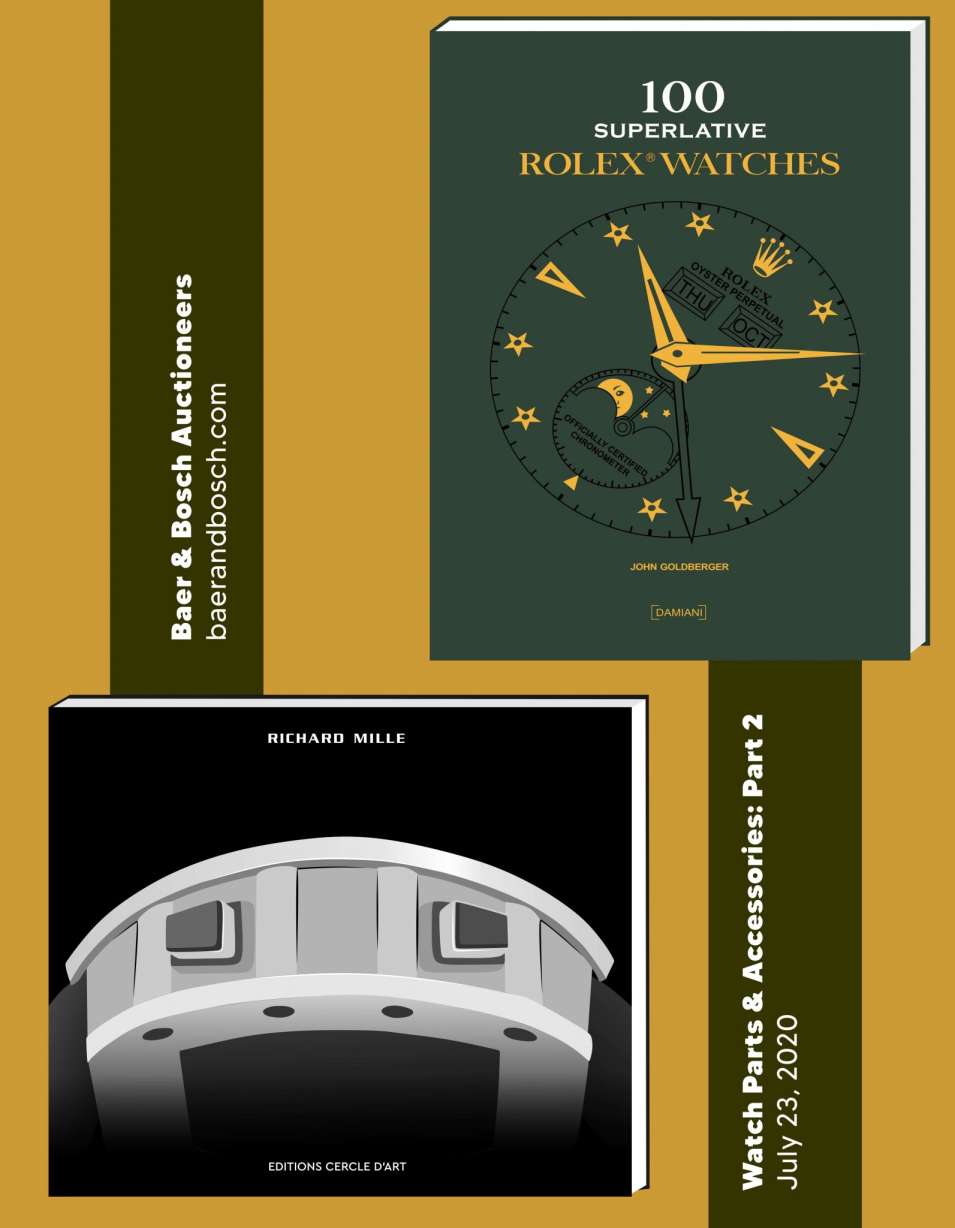
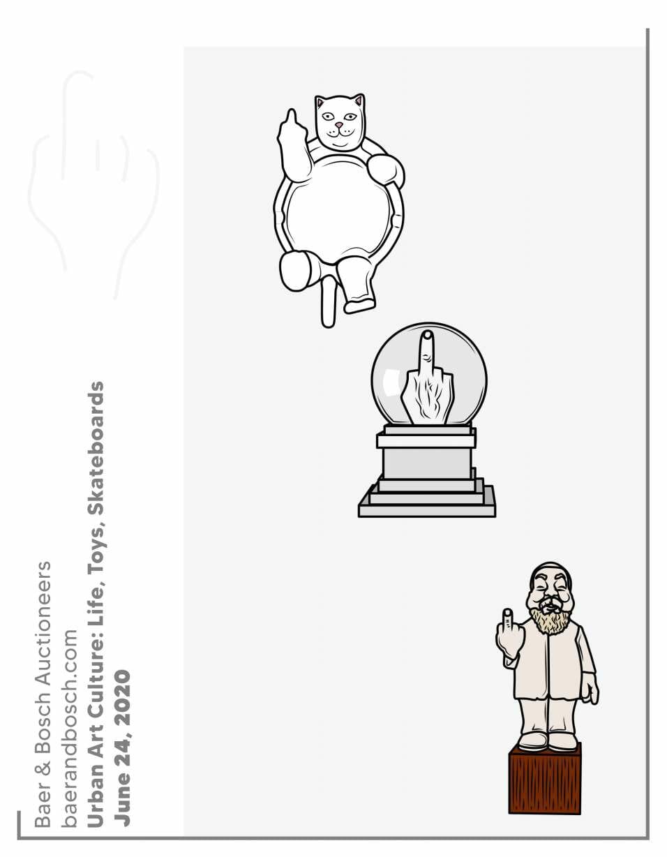
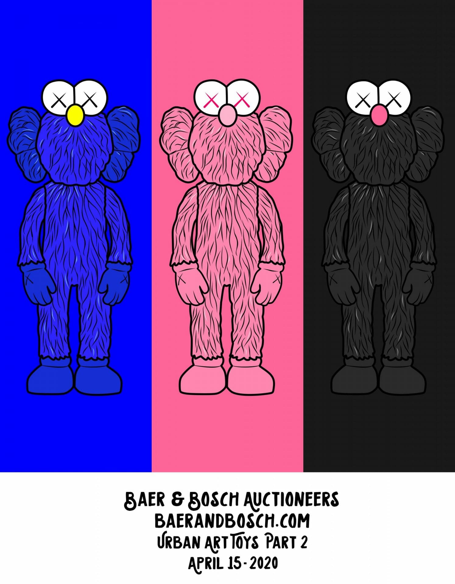
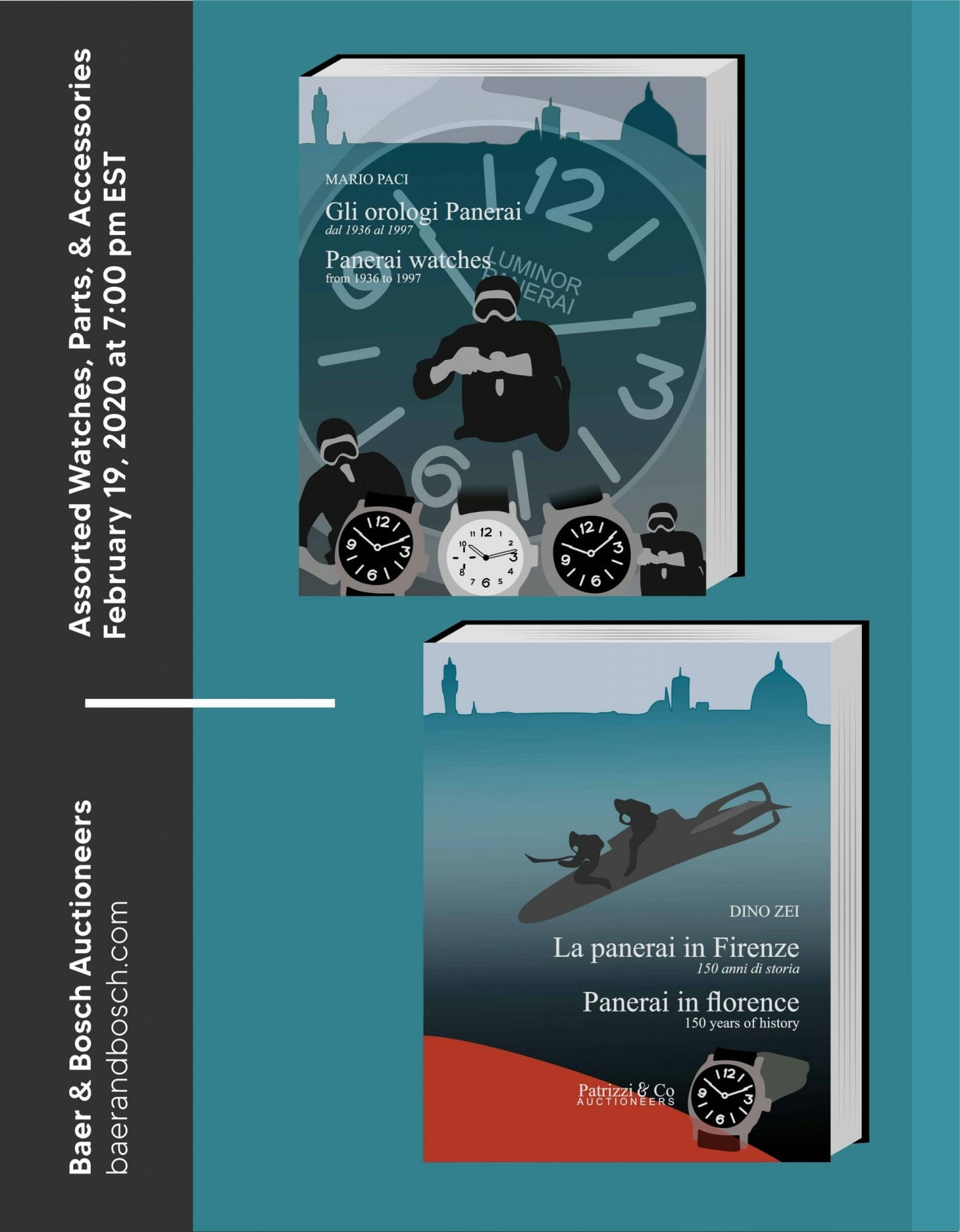
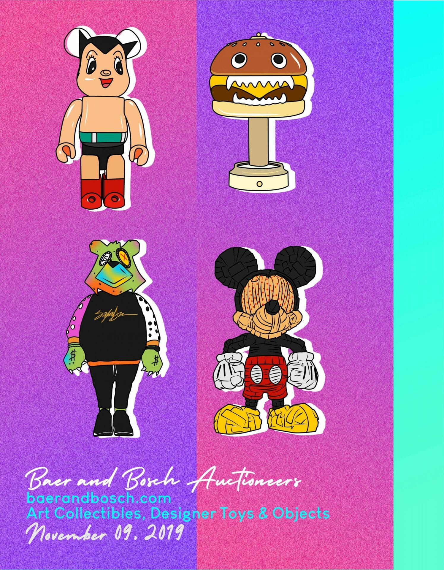
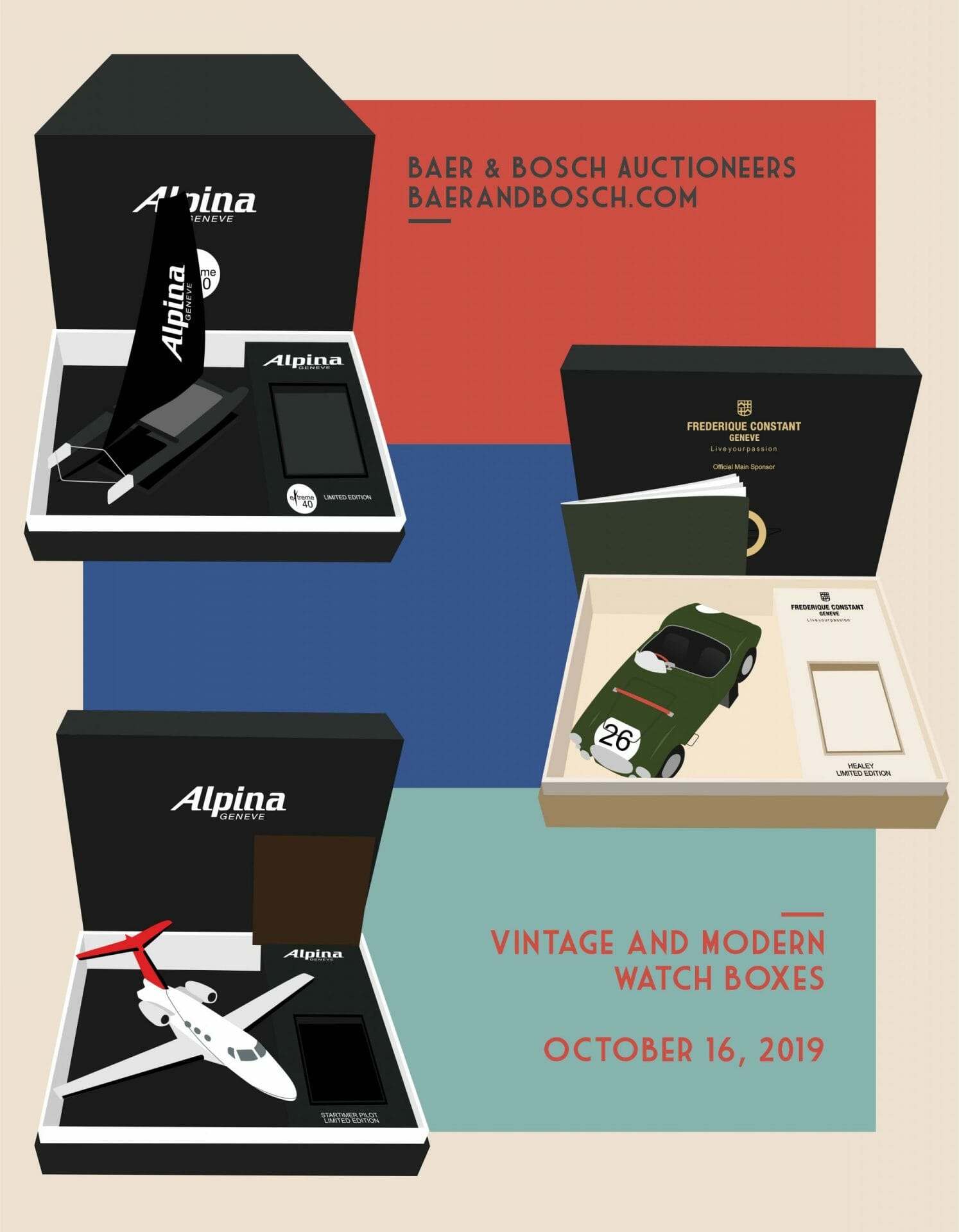
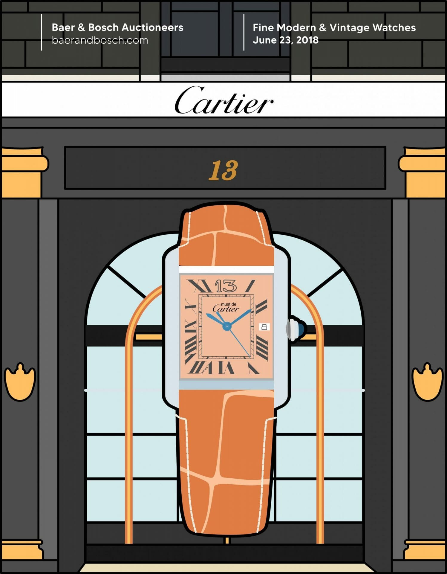
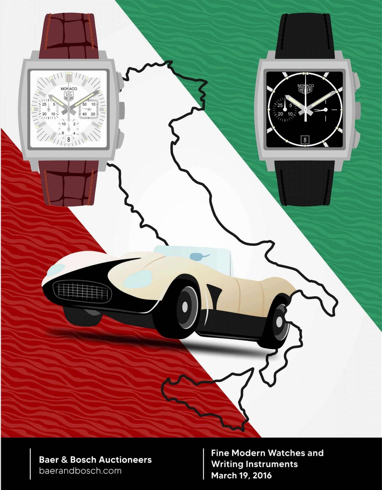
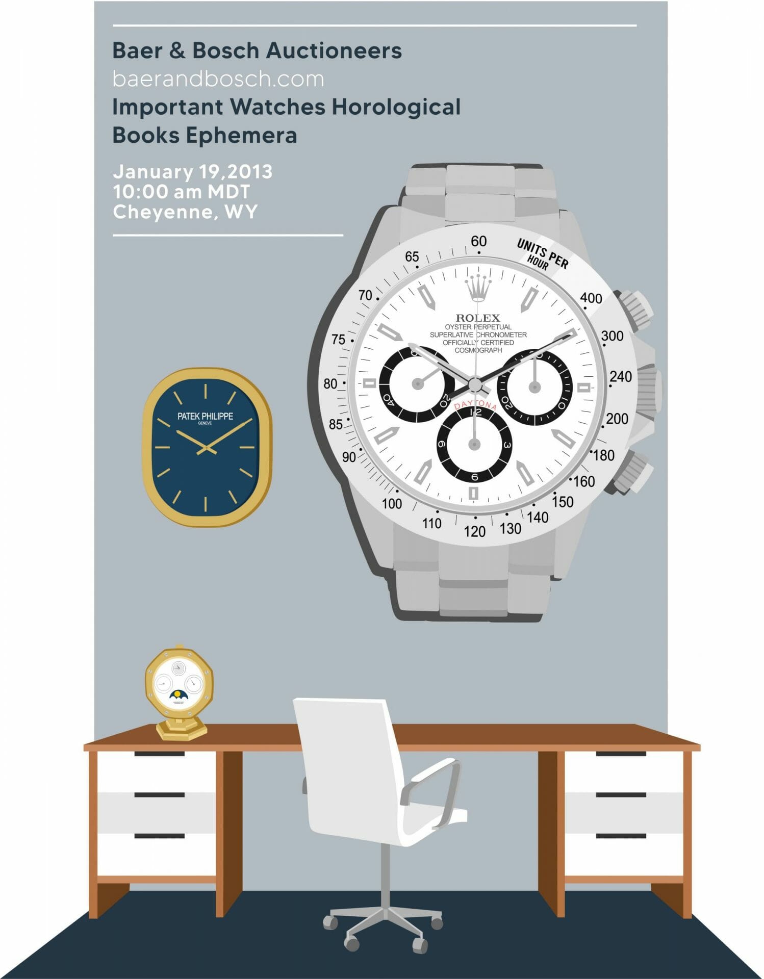
When you look at Baer & Bosch’s auction catalogs, there is a certain visual intelligence to the way they are laid out. The covers of each one was crafted by artists who used colors and subject matter as inspiration for their design. This ensured that every cover was cohesive with others from other auctions creating an identity around them without feeling like two separate worlds in different parts of town!
We wanted to highlight these artists and their work in a way that would make them shine. With this goal, we created the following:
- The cover of an auction catalog is designed by an artist and becomes part of the visual identity for all future catalogs – even if they have drastically different photography or content on the other pages, the overall feeling of all the catalogues reflects the cohesiveness of the brand.
- The front page is always an illustration of items from that auction. This becomes the anchor for all subsequent pages, and as different artists are showcased throughout the catalog, we see how they work together to create this visual unity in diversity.
- We have also organized the catalog by category, and within each section, we highlight one brand. This not only highlights the work, but it is a great way to invite readers into an intimate relationship with just one item in this vast and diverse auction offerings.
- The layout of the catalogue is also designed to be easy on the eye, with multiple pages that are full color throughout so you can see every detail clearly without having to turn your head from side to side.
This creates a cohesive experience where each page offers something new but still feels like part of one larger narrative.
See what we did for Baer & Bosch Auctioneers’ June, 26, 2021 auction catalog featuring Contemporary Collection
To find out more about our work for Baer & Bosch Auctioneers or any of our collaborations with other brands, get in touch.

